A gentle introduction to prediction with Machine Learning
How can we generate predictions using Machine Learning? How do basic mathematical tools allow us to make better decisions?
I am absolutely passionate about my job. Studying Machine Learning is one of the most exciting journeys of my life. And yet, this topic is too frequently cloaked in code or obscure mathematical formulae.
With this post, I would like to share this important part of my life with my non-technical family and friends.
My main reason to do so is that these people have taught me how to speak, read, and think. I cannot imagine letting our lives pass without sharing what I spend the majority of my awake hours working on. Let’s get into it!
Prediction and Perception
Humans are prediction machines.
We are constantly wondering what will happen tomorrow. What will the weather be like? What outfit should I prepare?
We constantly map perceptions to concepts. To my right, I do not see an undefined orange blob. My experience living in this world allows me to map light signals to the concept of “tangerine”. When I see my friend smiling, I map this to “happiness”. When finding colourful fruits in a forest, we would map the attributes of the fruit to either “edible” or “non-edible”. When a doctor looks at the radio image of a tumour, they map it to “benign” or “malignant”.
Even when perceiving the world around us, our brain is constantly generating predictions about future perceptions. As you read this sentence, you are also predicting the next …
… word.
This explains why we feel surprised when a surface is harder or softer than what we expect, or when a fruit we taste is sweeter than we expect. This happens when our direct perceptions conflict with our prediction of these perceptions. If you are interested, this fascinating topic is analysed in A Thousand Brains by Richard Dawkins.
As humans living in a more or less organised society, we have to make decisions that involve planning for the future. Prediction and forecasting are also a key component of managing:
- a household: how much food should I buy for the week?
- a business: how much beer should I stock in my pub ahead of a sunny Easter weekend?
Predictions yes, but of what?
Looking at the examples in the previous section, can you spot the two categories of predictions?
We can break prediction problems into two main types: regression and classification.
Regression is the prediction of continuous quantities. How much food will my family eat this week? How much beer will I sell this weekend?
Classification is the prediction of a label or class. Is this fruit edible or non-edible? Is this person happy or sad? Is this animal a dog or a cat? What breed of cat is this animal?
Predicting with Rules and Intuition
Even without Machine Learning, we have many ways to predict at our disposal. The main ones are (1) rules and (2) intuition.
As the manager of a pub, you could look at last year’s beer sales over the Easter weekend and order roughly the same amount for the coming Easter weekend. You could even develop a more sophisticated method that uses both last year’s and last week’s sales to come up with a more precise estimate. This is a typical example of a rule-based system.
A real-estate pricing analyst could come up with a system that would automatically determine the price of a property based on its surface area and neighbourhood. This could be done by looking at historical averages and coming up with a set of rules, such as “each additional square metre should increase the property price by 100”.
When dropped in the middle of a forest in a familiar landscape/climate, we can use our knowledge and past experience to map fruits to “edible” or not; a typical example of intuition.
As a doctor looking at a tumour on a scan, we can use a set of rules based on characteristics of the tumour (area of cell nuclei, perimeter of cell nuclei, etc…). For example, if the area of cell nuclei is superior to 1200 µm2, then it can be “malignant”.
As a practitioner having seen many examples of both benign and malignant tumours, you could also use your intuition. A certain tumour may just “look bad” based on what you have seen before.
Intuition
Intuition is one of our key human abilities. Cognitive reasoning is expensive, thinking about the world in rational terms is tiring. Intuition bypasses this thinking by some kind of hunch that is developed over time.
After being exposed to many tumour examples, a good radiologist can feel that something is wrong without having to reason about area/perimeter/etc. They just recognise a certain pattern and “know”.
I suspect we all experience this type of intuition. After a few years spent evolving in this world, we develop some kind of intuition. In many situations, we just know. We don’t know why we know it, and yet, we know it.
This article inspired by the work of Kahneman and Herbert Simon, shows the situations in which we can build and trust intuition:
The environment is unchanging or slow to change. Complex adaptive systems are poor places to develop intuition.
We have a large sample size. That is, we get a lot of practice.
We receive immediate and accurate feedback.
Can you see some of the drawbacks of rule-based systems and intuition?
Rule-based systems
Difficult to develop when systems become complex: for sales of beer in one pub, a rule-based system is still doable. But what if we now want to predict beer sales in 150 pubs? What if we also want to predict food sales? I don’t even want to start thinking about such a system
Rule-based are fixed: even after managing to build such a complex rule-based system, you would need to modify it every time the world changes. And the world changes often. Rules only apply so long as the reality used to create them stays the same
Intuition
Intuition takes time and experience: one can only build intuition over time. In our example, by seeing many observations of benign and malignant tumours
Intuition is expensive: as intuition takes time and experience to build, it is rare. Because it is rare, it is expensive. Not everyone can have access to skilled specialists all the time
Intuition is as fallible as humans: we all have good days and bad days. Doctors are not immune from the all too human feelings of tiredness, anger, and frustration
Now, can we do better than intuition or rule-based systems? Can we use historical data to build systems that learn automatically? This will be discussed in the next section.
Predicting by Learning from Data
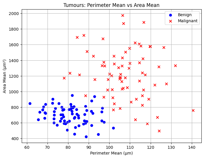
Now, imagine you are given a dataset of one million tumour examples, both benign and malignant. For each, you are given its area and perimeter. Is there a way you could build a system that learns to classify tumours based on these two features?
First, you could start by plotting each tumour as a point in a two-dimensional space, using their area and perimeter of cell nuclei as coordinates. Each cross represents a malignant tumour, each circle a benign tumour.
Code used to generate the plot
import numpy as np
import matplotlib.pyplot as plt
from sklearn.datasets import make_blobs

benign_center = [80, 700]
malignant_center = [110, 1200]

n_samples = 70

X_benign, _ = make_blobs(n_samples=n_samples, centers=[(0, 0)], cluster_std=1, random_state=1)
X_malignant, _ = make_blobs(n_samples=n_samples, centers=[(0, 0)], cluster_std=1, random_state=2)

benign_std = [10, 120]
malignant_std = [12, 300]

X_benign = X_benign * benign_std + benign_center
X_malignant = X_malignant * malignant_std + malignant_center

plt.figure(figsize=(8,6))
plt.scatter(X_benign[:,0], X_benign[:,1], marker='o', color='blue', label='Benign')
plt.scatter(X_malignant[:,0], X_malignant[:,1], marker='x', color='red', label='Malignant')
plt.xlabel('Perimeter Mean (µm)')
plt.ylabel('Area Mean (µm²)')
plt.title('Tumours: Perimeter Mean vs Area Mean')
plt.legend()
plt.grid(True)
plt.show()
But what is space?
We talk about space all the time. We know it when we see it. In an empty room, there is a lot of space. On a full aeroplane in Economy, there is little space. In astronomy, space is everything that is around us expanding in every direction.
Yet, what is space?
Space is a set with structure. A set here is a collection. A bag of items is a set of items, and yet, a bag is not space as it does not have structure. The structure of a two-dimensional space (for example) is its set of \(x\) and \(y\) coordinates.
A simple example: the set \(\{(0,0), (1,0), (0,1), (1,1)\}\) forms a two-dimensional space with four points. Every point of this space is embedded in this two dimensional structure, as they all contain two coordinates.
As you may be able to see already, the two groups seem to be separable based on these two features. What this means is that based on these two features, we can differentiate benign tumours from malignant tumours relatively easily.
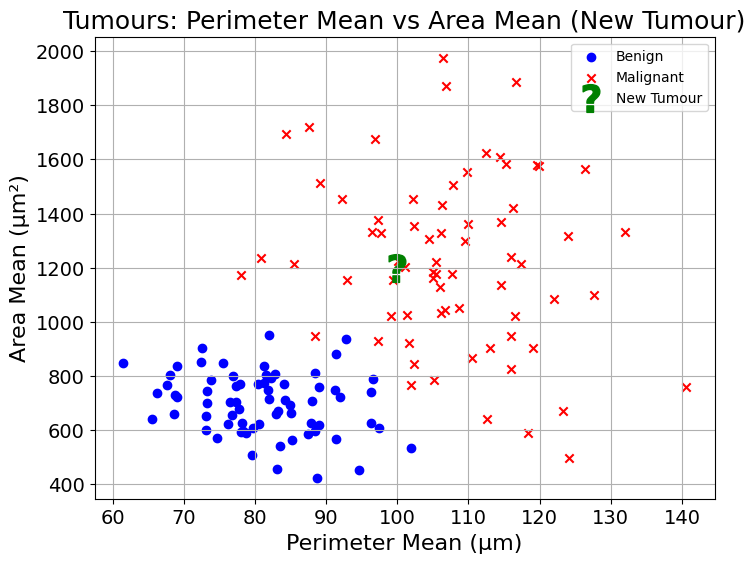
Now, back to our example, let’s imagine that a new patient arrives. From their scan, we see that the tumour has area mean of 1200 µm² and perimeter mean of 100 µm. Let’s plot it on the same chart as all other observations:
Code used to generate the plot
plt.figure(figsize=(8,6))
plt.scatter(X_benign[:,0], X_benign[:,1], marker='o', color='blue', label='Benign')
plt.scatter(X_malignant[:,0], X_malignant[:,1], marker='x', color='red', label='Malignant')

plt.scatter(100, 1200, marker=r'$\mathbf{?}$', color='green', s=400, label='New Tumour')

plt.xlabel('Perimeter Mean (µm)', fontsize=16)
plt.ylabel('Area Mean (µm²)', fontsize=16)
plt.title('Tumours: Perimeter Mean vs Area Mean (New Tumour)', fontsize=18)
plt.legend()
plt.grid(True)
plt.xticks(fontsize=14)
plt.yticks(fontsize=14)
plt.show()
You are not a doctor, but if you had to guess, how would you classify this tumour? If you said malignant, I agree with you. Now, why did you say that?
It seems that most of its closest neighbours in this two-dimensional space are also malignant. This is something that can be observed visually.
If, with no prior medical experience, you were able to generate a reasonable prediction, I have good hopes that a computer could do the same. How could you apply that Nearest Neighbour reasoning to a computer?
To do so, you would probably need to find the closest neighbours to a new observation. One of the issues there is that a computer cannot “see” the plot and come up with the prediction like we just did.
Calculating distance
To find Nearest Neighbours using a computer, you would need a way to calculate the distance between two points. How would you do this?
Hint: Take a look at the example below:

Code used to generate the plot
import matplotlib.pyplot as plt

plt.figure(figsize=(6,6))
plt.scatter([1,5], [1,4], color=['blue','red'])
plt.text(1,1, 'A (1,1)', fontsize=14, ha='right')
plt.text(5,4, 'B (5,4)', fontsize=14, ha='left')
plt.xlabel('x', fontsize=16)
plt.ylabel('y', fontsize=16)
plt.title('Two Points in 2D Space', fontsize=18)
plt.xticks(fontsize=14)
plt.yticks(fontsize=14)
plt.grid(True)
plt.show()| Point | \(x\) | \(y\) |
|---|---|---|
| A | 1 | 1 |
| B | 5 | 4 |
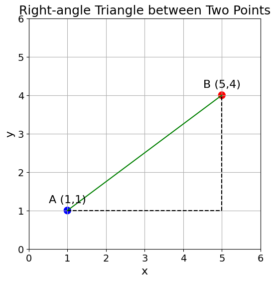
What if instead of showing the two points on their own, we saw them as two points forming a right-angle triangle?
Code used to generate the plot
plt.figure(figsize=(6,6))
plt.scatter([1,5], [1,4], color=['blue','red'], s=100)
plt.plot([1,5],[1,1],'k--')
plt.plot([5,5],[1,4],'k--')
plt.plot([1,5],[1,4],'g-')
plt.text(1,1.2, 'A (1,1)', fontsize=16, ha='center')
plt.text(5,4.2, 'B (5,4)', fontsize=16, ha='center')
plt.xlabel('x', fontsize=16)
plt.ylabel('y', fontsize=16)
plt.title('Right-angle Triangle between Two Points', fontsize=18)
plt.xticks(fontsize=14)
plt.yticks(fontsize=14)
plt.xlim(0, 6)
plt.ylim(0, 6)
plt.grid(True)
plt.show()
Here, your Middle School nightmares may come back, and rightfully so; this is the Pythagorean theorem.
From the Pythagorean theorem, we get:
\[ a^2 + b^2 = c^2 \]
In our case, \(c\) is the distance we are looking for. \(a\) and \(b\) are defined by \((x_b - x_a)\) and \((y_b - y_a)\) respectively.
This would yield:
\[ (x_b - x_a)^2 + (y_b - y_a)^2 = \text{distance}^2 \]
Shuffling some symbols around, you could then compute the distance between point A and B as follows:
\[ \text{Distance} = \sqrt{(x_b - x_a)^2 + (y_b - y_a)^2} \]
And that is it, you have computed the distance between two points.
Doing so for our example points A and B, we get the distance:
\[ \text{Distance} = \sqrt{(5 - 1)^2 + (5 - 1)^2} = \sqrt{16 + 16} = \sqrt{32} \approx 5.66 \]
Polling Nearest Neighbours
We can now calculate the distance between the new tumour example and all tumours we have in the dataset.
By definition, the Nearest Neighbour of this new tumour are the points that are closest to it; in other words, that have the smallest distance.
We are making progress. For any new tumour that comes in, we can get a list of its closest neighbours. Based on this list, how would you generate a prediction?
As a first step, a simple majority vote should do. In our example, all 5 of the new tumour’s nearest neighbours are malignant, a cause of concern.
If 3 had been malignant and 2 had been benign, the tumour would also have been classified as “malignant”. Using the majority vote approach, it makes sense to sample an odd number of neighbours.
Beyond majority vote
In some contexts, majority vote may not be enough. As an example, what if out of the tumour’s nearest neighbours, 3 are benign and 2 are malignant?
In terms of majority vote, the tumour would be classified as “benign”. However, as a patient, in this scenario, I would probably want to have the tumour tested further.
Instead of outputting labels such as “benign” or “malignant”, the model we build could also output probabilities. These probabilities would show a degree of belief in one of the labels.
Going back to our example, we could “average” nearest neighbour labels. We could do so by treating each benign tumour as a 0 and each malignant tumour as a 1. In the case of 3 benign and 2 malignant neighbours, the predicted probability of malignancy could be computed as:
\[ \text{Predicted Probability} = \frac{0+0+0+1+1}{5} = \frac{2}{5} = 40\% \]
This predicted probability gives more information than a single binary label.
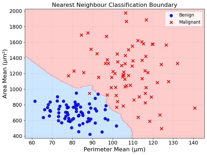
This approach is generally referred to as k-nearest neighbours or KNN directly. The k refers to the numbers of neighbours considered.
But how many neighbours should you consider in your calculations? This is up to the person who designs the model to decide. How this decision is made would be the topic of yet another blog post. We will go with 5 neighbours for now.
Using these 5 nearest neighbours, we can now classify any new tumour. The classification based on the majority vote of the 5 nearest neighbours is called the prediction of the model.
Code used to generate the plot
import numpy as np
import matplotlib.pyplot as plt
from sklearn.neighbors import KNeighborsClassifier
from matplotlib.colors import ListedColormap
from sklearn.preprocessing import StandardScaler

# Use your existing data
benign_center = [80, 700]
malignant_center = [110, 1200]
n_samples = 70
X_benign, _ = make_blobs(n_samples=n_samples, centers=[(0, 0)], cluster_std=1, random_state=1)
X_malignant, _ = make_blobs(n_samples=n_samples, centers=[(0, 0)], cluster_std=1, random_state=2)
benign_std = [10, 120]
malignant_std = [12, 300]
X_benign = X_benign * benign_std + benign_center
X_malignant = X_malignant * malignant_std + malignant_center

# Combine into features and target
X = np.vstack([X_benign, X_malignant])
y = np.hstack([np.zeros(len(X_benign)), np.ones(len(X_malignant))])

# Scale the features
scaler = StandardScaler()
X_scaled = scaler.fit_transform(X)

# Create custom colors with brighter hues
custom_cmap = ListedColormap(['#80C2FF', '#FF8080'])  # Brighter blue and red

# Fit a KNN classifier with scaled data
clf = KNeighborsClassifier(
    n_neighbors=5,
    weights='uniform',
    algorithm='auto',
    metric='euclidean'
)
clf.fit(X_scaled, y)

# Create the decision boundary plot
plt.figure(figsize=(8, 6))

# Create a meshgrid for displaying the decision boundary
h = 0.5  # step size in the mesh
x_min, x_max = X[:, 0].min() - 5, X[:, 0].max() + 5
y_min, y_max = X[:, 1].min() - 50, X[:, 1].max() + 50
xx, yy = np.meshgrid(np.arange(x_min, x_max, h),
                     np.arange(y_min, y_max, h))

# Scale the mesh points the same way the training data was scaled
mesh_points = np.c_[xx.ravel(), yy.ravel()]
mesh_points_scaled = scaler.transform(mesh_points)

# Predict using the scaled mesh points
Z = clf.predict(mesh_points_scaled)
Z = Z.reshape(xx.shape)

# Plot the decision boundary
plt.contourf(xx, yy, Z, alpha=0.4, cmap=custom_cmap)

# Plot the data points (using original unscaled coordinates for display)
plt.scatter(X_benign[:,0], X_benign[:,1], marker='o', color='blue', label='Benign',
            s=60, edgecolor='darkblue', alpha=0.9, linewidth=1)
plt.scatter(X_malignant[:,0], X_malignant[:,1], marker='x', color='red', label='Malignant',
            s=60, linewidth=2)

plt.title('Nearest Neighbour Classification Boundary', fontsize=16)
plt.xlabel('Perimeter Mean (µm)', fontsize=16)
plt.ylabel('Area Mean (µm²)', fontsize=16)
plt.xticks(fontsize=14)
plt.yticks(fontsize=14)
plt.legend(fontsize=12)
plt.grid(True, alpha=0.3)
plt.tight_layout()
plt.show()
Putting it all together
That is it! We can now classify new tumours based on their area and perimeter. The method explored in this article does so by finding the new tumour’s nearest neighbours and applying a majority vote - or any other type of aggregation.
In a sense, we build a map from input, area and perimeter of cell nuclei, to output, the label “benign” or “malignant” tumour. This is what prediction with Machine Learning is all about.
Of course, we are not done. These maps can get a lot more complicated. Many questions are still unanswered:
- How to predict continuous quantities using Nearest Neighbours? (I am sure you may have an idea already, if not, think about it)
- How to evaluate the quality of a model?
- How to select the number of neighbours in a Nearest Neighbours algorithm?
- How are Nearest Neighbours algorithms implemented in practice?
- Are there other types of models?
Over the next few weeks, I will add articles to tackle some of these questions. Sign up to my newsletter to hear about them!
I further developed the ideas of this post in a short book called Machine Learning Intuition, you can find it on Gumroad or Amazon. It uses this post’s teaching style to build the intuition for Machine Learning and how it can be used in practice. I hope you like it!