Adventures with Monte Carlo Estimations
What if you could solve tough problems with a list of random numbers? This article will show how Monte Carlo methods can be used to solve problems such as estimating the average value of a function or the value of \(\pi\).
As computer and data scientists, this is a fantastic tool. Instead of having to compute probabilities analytically, we can get close enough to the result using simulations. If that sounds interesting, let’s get into it.
How did Monte Carlo methods get such a cool name?
Monte Carlo estimations get their fancy name from the Monte Carlo Casino in Monaco. But why? The mathematician Stanislaw Ulam worked on these methods in the 1940s at Los Alamos, the United States’ atomic weapon research facility. As everything there was secret, the team working on this project needed a code name. They settled on “Monte Carlo”.
The idea came to Ulam when trying to compute solitaire probabilities analytically. He quickly realised that a way to avoid this tedious work would be to run thousands of simulations and estimate these probabilities from the observed outcomes.
Estimating the average value of a function
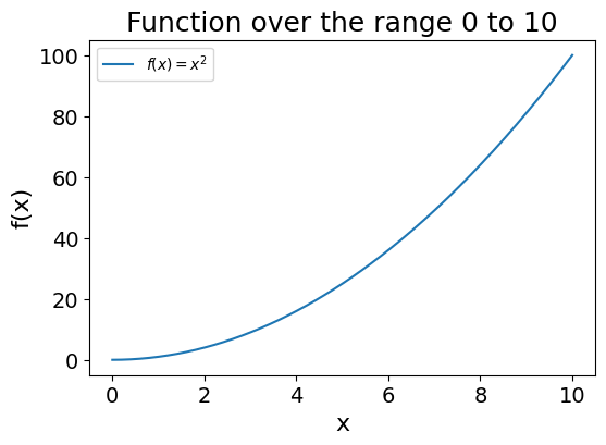
How would you estimate the average value of a function over a range? As an example, let’s use the \(f(x)=x^2\) function over the range [0,10].
Code used to generate the plot
import numpy as np
import matplotlib.pyplot as plt

x = np.linspace(0, 10, 200)
y = x**2

plt.figure(figsize=(6,4))
plt.plot(x, y, label="$f(x)=x^2$")
plt.title("Function over the range 0 to 10", fontsize=18)
plt.xlabel("x", fontsize=16)
plt.ylabel("f(x)", fontsize=16)
plt.tick_params(axis='both', which='major', labelsize=14)
plt.legend()
plt.show()
You may remember your calculus classes and use the following function to calculate the range of a function \(f(x)\) over the range \([a,b]\): \[\frac{1}{b-a}\int_a^b f(x)\,dx\]
Note: If this does not ring any bells, just read on, this is not relevant to the article.
But what if we are dealing with a multivariate function (taking more than a single value \(x\) as input)? Integrating some types of functions is also notoriously tough.
So how could we use simulations instead?
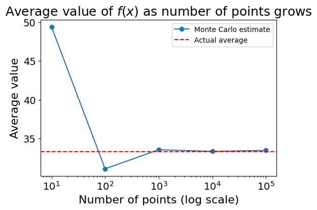
You could draw \(N\) (any large number) random points over the range, record the function values, and calculate their average. Their average should be very close to the analytically computed average.
Code used to generate the plot
import numpy as np
import matplotlib.pyplot as plt

def f(x):
    return x**2

N_values = [10, 100, 1000, 10_000, 100_000]
mc_averages = []

for N in N_values:
    xs = np.random.uniform(0, 10, N)
    avg_value = np.mean(f(xs))
    mc_averages.append(avg_value)

analytical_avg = (1/(10-0)) * (1/3) * (10**3)

plt.figure(figsize=(6,4))
plt.plot(N_values, mc_averages, marker='o', label="Monte Carlo estimate")
plt.axhline(y=analytical_avg, color='r', linestyle='--', label="Actual average")
plt.xscale('log')
plt.title("Average value of $f(x)$ as number of points grows", fontsize=18)
plt.xlabel("Number of points (log scale)", fontsize=16)
plt.ylabel("Average value", fontsize=16)
plt.tick_params(axis='both', which='major', labelsize=14)
plt.legend()
plt.show()
As you may see the accuracy of the estimate increases as the number of samples grows.
Estimating the value of \(\pi\)
Computing average values is nice, but can we do anything a bit more spectacular?
Using the idea of a simulation, can you think of a way to estimate the value of \(\pi\)?
As a hint, you would not even need a computer for this; you could also estimate the value of \(\pi\) using darts thrown on a square surface. Take a moment to think about how you would do this before reading on.
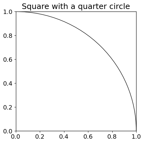
On that surface, you could draw a quarter of a circle, with the same radius as the side of the square (see image below):
Code used to generate the plot
import matplotlib.pyplot as plt
import matplotlib.patches as patches

fig, ax = plt.subplots(figsize=(5,5))
square = patches.Rectangle((0,0),1,1, fill=False)
quarter_circle = patches.Arc((0,0),1,1, 0, 0, 90)

ax.add_patch(square)
ax.add_patch(quarter_circle)

plt.xlim(0,1)
plt.ylim(0,1)
plt.title("Square with a quarter circle", fontsize=18)
plt.tick_params(axis='both', which='major', labelsize=14)
plt.show()
You may start to see where I am going with this.
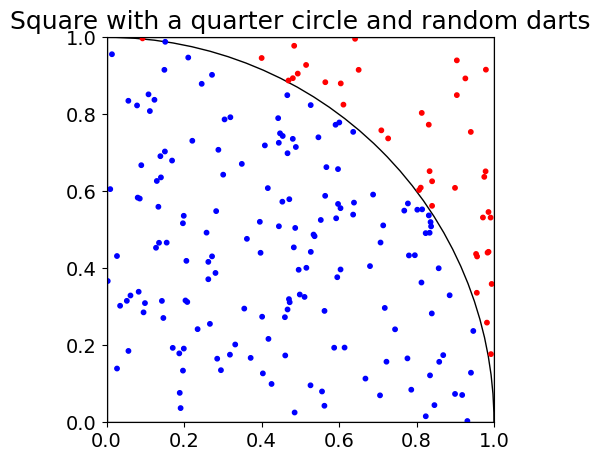
If you are as good as me at darts, darts will be thrown at random, and can land on any part of this surface. With a sufficiently large number of darts, the number of darts landing within the circle, compared to the total number of darts, should be the ratio of the quarter circle’s area to the square’s area.
This is a critical point to grasp. With a large number of random samples, the ratio of darts falling inside the circle to the total number of darts will converge towards the ratio of the circle’s to the square’s area. All that this is saying is that the larger the circle within the square, the more darts will end up on it. This may sound trivial, but is the principle that will allow us to estimate \(\pi\).
Code used to generate the plot
import matplotlib.pyplot as plt
import numpy as np

N = 200
xs = np.random.rand(N)
ys = np.random.rand(N)

fig, ax = plt.subplots(figsize=(5,5))
# Square boundary
square = patches.Rectangle((0,0),1,1, fill=False)
ax.add_patch(square)

# Quarter circle boundary
quarter_circle = patches.Arc((0,0),1,1, 0, 0, 90)
ax.add_patch(quarter_circle)

# Dots
colors = []
for i in range(N):
    if xs[i]**2 + ys[i]**2 <= 1:
        colors.append('blue')
    else:
        colors.append('red')

plt.scatter(xs, ys, c=colors, s=10)
plt.xlim(0,1)
plt.ylim(0,1)
plt.title("Square with a quarter circle and random darts", fontsize=18)
plt.tick_params(axis='both', which='major', labelsize=14)
plt.show()
Throwing some darts, we get 160 landing in the quarter circle out of 200 (I did not expect such a round number, but hey, randomness does not always look random). Now how can we get to \(\pi\) from this observation?
As a quick reminder, a circle’s area is given by the formula: \(\pi r^2\) \[ \frac{\text{Number of darts in quarter circle}}{\text{total number of darts}} \approx \frac{\text{area of quarter circle}}{\text{total area of surface}} \\ \]
Here the side of the square is equal to the radius of the circle, both equal to 1. \[ \frac{\text{area of quarter circle}}{\text{total area of surface}} = \frac{\frac{\pi r^2}{4}}{r^2} \] \[ \frac{\frac{\pi r^2}{4}}{r^2} = \frac{\pi}{4} \]
\[ \pi \approx 4 \cdot \frac{\text{Number of darts in quarter circle}}{\text{total number of darts}} \]
Using the counts in our example, we would \(\pi \approx 4 \cdot \frac{160}{200} = 3.2\).
Good, but not close enough.
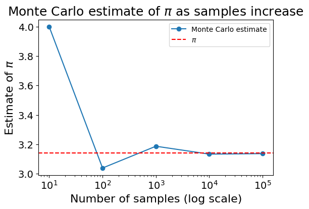
Similar to the previous example, the accuracy of the estimate increases with the number of samples. The following chart shows how the Monte Carlo estimate gets closer to the actual value of \(\pi\) over time:
Code used to generate the plot
import numpy as np
import matplotlib.pyplot as plt

def estimate_pi(N):
    xs = np.random.rand(N)
    ys = np.random.rand(N)
    inside = (xs**2 + ys**2) <= 1
    return 4 * np.sum(inside) / N

N_values = [10, 100, 1000, 10_000, 100_000]
pi_estimates = [estimate_pi(n) for n in N_values]

plt.figure(figsize=(6,4))
plt.plot(N_values, pi_estimates, marker='o', label="MC estimate")
plt.axhline(y=np.pi, color='r', linestyle='--', label="$\pi$")
plt.xscale('log')
plt.title("Monte Carlo estimate of $\pi$ as samples increase", fontsize=18)
plt.xlabel("Number of samples (log scale)", fontsize=16)
plt.ylabel("Estimate of $\pi$", fontsize=16)
plt.tick_params(axis='both', which='major', labelsize=14)
plt.legend()
plt.show()
With \(10^6\) samples, I got \(\pi \approx 3.1415\), a much closer guess.
As a fun fact extracted from Crilly’s 50 Mathematical Ideas, if you would like to remember the decimal of \(\pi\), you can use the word counts of each word in Keith’s Near a Raven poem (full version here):
Poe, E.
Near a Raven
Midnights so dreary, tired and weary.
Silently pondering volumes extolling all by-now obsolete lore.
An ominous vibrating sound disturbing my chamber’s antedoor.
“This”, I whispered quietly, “I ignore”.
Each word there represents a decimal. Starting with “Poe, E”. (3, 1), continuing with “Near a Raven” (416), and so on. Here you go, your next party trick.
Final Thoughts
Isn’t this method incredible? As data scientists, we frequently get thrown into abstraction when hearing (or saying): “we use Monte Carlo methods to sample from the posterior distribution …” that we sometimes lose track of this method’s beautiful simplicity.
The next time you face a tough analytical problem, can you use simulations to get closer to an answer?
To explore this topic more rigorously, I would recommend exploring Vershynin’s High Dimensional Probability course, available here.